The FAB Branding
When we set out to create the visual identity for the Fans Advisory Board, we wanted it to feel intentional, confident, and rooted in the reality of supporting Bristol City FC. Not decorative. Not overworked. Something that felt like it belonged to the club and its supporters, but also looked forward, not back.
The inspiration came from outside of traditional football branding. We looked to the worlds of design, culture, and modern utility. Minimalist, but with punch. Functional, but full of intent. Connected to the legacy of our club and a badge that feels so entwined with our culture.
That balance felt important. Supporting a football club is emotional, messy, and deeply human, but the structures around it need clarity, calm, and trust. The FAB identity needed to reflect that. Strong enough to stand its ground. Quiet enough to listen.
The logo system is deliberately simple. Clean lines, confident forms, and a sense of weight without excess. There’s no noise for the sake of it. Every element has a job to do. Much like the Board itself, the identity isn’t here to shout the loudest… it’s here to be present, consistent, and dependable.
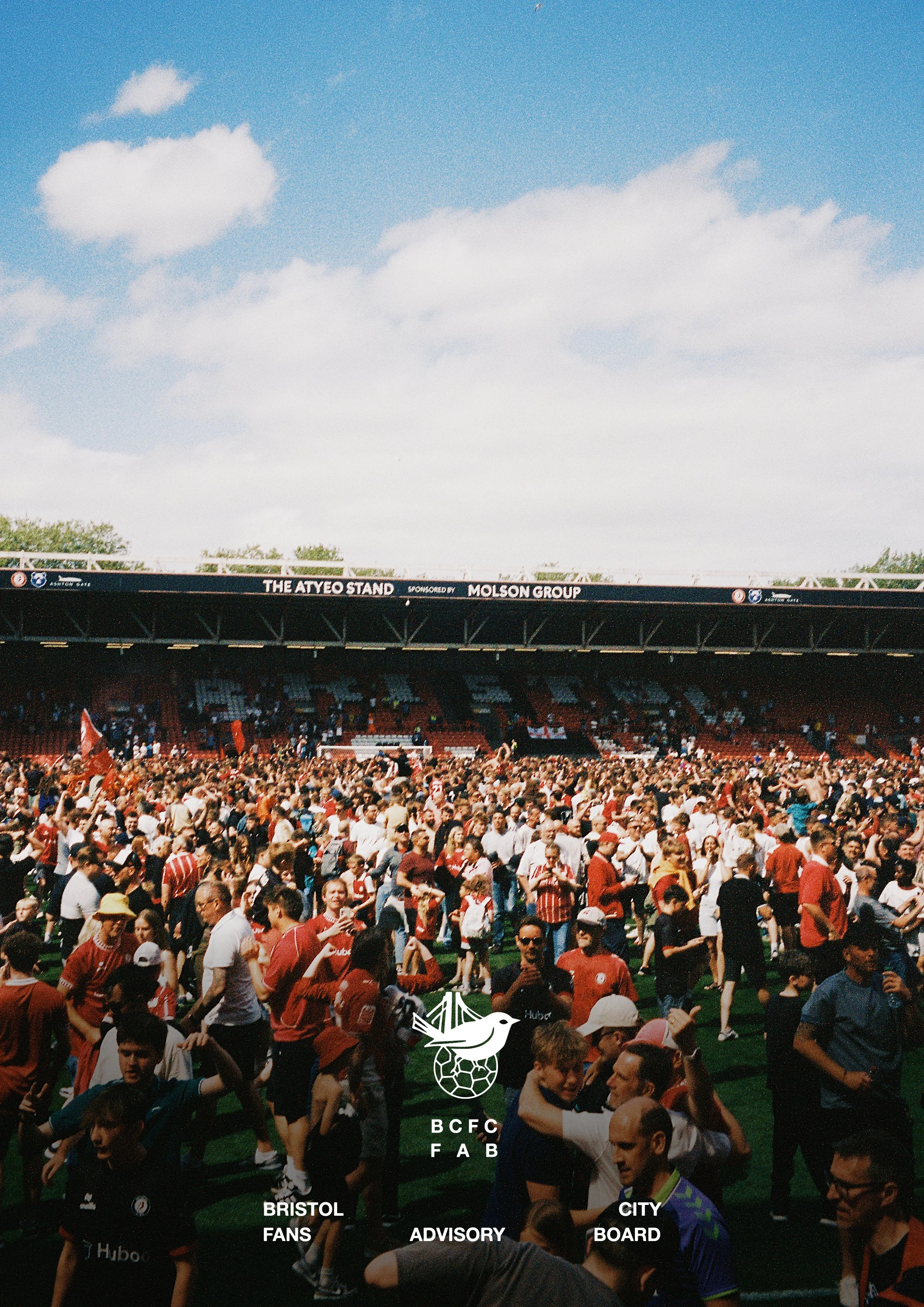
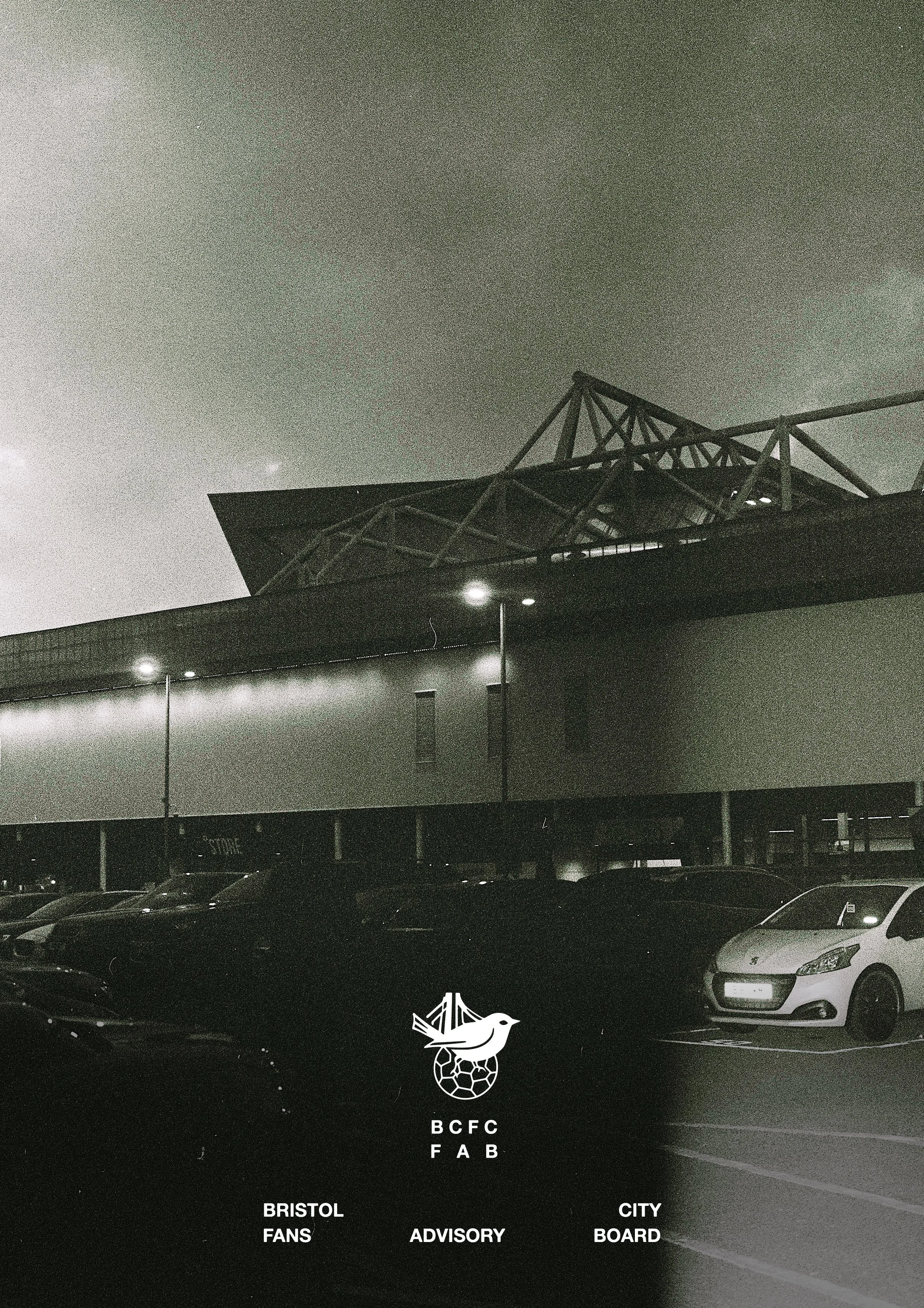
We wanted the mark to feel at home on a matchday car park wall, on a noticeboard, or on a digital platform. Something that feels modern without being trendy. Timeless without being safe. A visual language that respects the seriousness of the role while still carrying the energy and pride that comes with supporting this club.
Just like the FAB itself, this identity is about trust. It’s about creating something supporters can recognise and feel comfortable engaging with. Something that doesn’t feel corporate or distant, but still carries authority and credibility when sitting across the table from the club.
We don’t believe a Fans Advisory Board should look ornamental. It should look like it belongs to the people it serves and serious about the responsibility it carries. This identity is a reflection of that belief.
As with everything we do, this is only the starting point. The identity will live, adapt, and evolve through use shaped by conversations, feedback, and the realities of supporting Bristol City through the ups and downs.
But at its core, the intention is simple: strong, clear, and confident design, built to support open dialogue and a better experience for supporters.
That’s the thinking behind the badge you see here.


